
 | Chapter 14 User Interfaces with Tk |  |
This section provides an introduction to most of the interesting widget classes implemented in Tk and Tix and exercises their commonly used configuration options and methods. To reduce clutter and to allow quick lookups later on (when you know what you are looking for), this extensive set of properties and methods is provided as a separate appendix: Appendix A, Tk Widget Reference. Be aware that this chapter, extensive as it is, is only a subset (though a significant subset) of the entire Tk widget feature set. It also does not cover all widgets provided by Tk and Tix. Perl/Tk comes with the entire original well-written and comprehensive Tk documentation.
Please skim Table A.1 to get an idea of the kind of configurable properties that all widgets share. Most of these properties are ordinary strings or numbers, but three types of properties are worth delving into some detail before we proceed to discussing the actual widgets: fonts, images, and colors.
Font values are specified in the XLFD format (X Logical Font Description), which consists of 14 fields separated by hyphens, as shown in Figure 14.2.
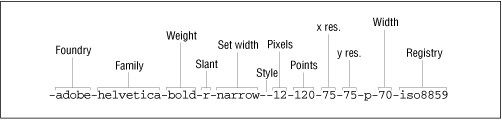
Fortunately, we don't have to remember the purpose of most of these fields. Any of these fields can have the wildcard "*" or "?", but it is important to get the number of hyphens right. On the X Windows system, there are two utilities, a graphical one called fontsel, and a batch utility called xlsfonts, that list all combinations of these fields available, so it is a simple matter of picking one. Essentially, you have to look only for the foundry, family, weight, slant, and points fields; ignore the rest of the fields. Note that "points" is in tenths of points, so 120 means a 12-point font. The slant can be "i" for italic or "r" for regular. To set the font of a widget, you configure its font property:
$label->configure (
   font => '-adobe-helvetica-medium-r-normal--8-80-75-75-p-46-*-1');
Once Perl/Tk is ported to the Windows and Mac, font values can be specified in either the XLFD format or the simpler Windows style: Helvetica 24 bold. The former format will continue to be supported on all platforms.
Some widgets, such as buttons and labels, can display two-color bitmaps or multi-color pixmaps. Because the same bitmap or image can be used to decorate more than one widget, Tk considers them to be objects that are rendered in one or more places. That is, the image object holds the data, and the widgets know how to render them in their own space. Hence, two steps are involved in displaying a bitmap or a pixmap on a widget: create an image object given an image file, and configure the widget's bitmap or pixmap property with the image object.
Depending on the type of image file you have, you have to make one of three calls to create the appropriate type of image object:
#For XBM (X Bitmaps) only
$image = $label->Bitmap(file => 'face.xbm');

#For XPM (X Pixmaps only)
$image = $label->Pixmap(file => 'smiley.xpm');

#For GIF or PPM (Portable pixmap) formats, use the Photo constructor
$image = $label->Photo(file => 'frown.gif');
Now you can change the label's image easily:
$label->configure (image => $image);
Note that if the image is a bitmap, you must use the "bitmap" option, and if it is an XPM or GIF files, use the "image" property. In the bitmap case, the "foreground" and "background" options dictate the two colors; for images, the file supplies its own colors.
Colors can be given symbolic names such as "red" and "yellow." The library directory in an X installation has a file called rgb.txt that enumerates all the available symbolic names. Alternatively, you can give RGB values in the form #RGB, #RRGGBB, #RRRGGGBBB, or #RRRRGGGGBBBB, where each R, G, or B represents one hexadecimal digit of red, green, or blue intensity, respectively.
Our detour is now complete; let us briefly visit Tk's and Tix's widgets.
The standard widget properties described in Table A.1 pretty much cover everything that labels have to offer. They are also fairly self-explanatory, so we will not say more about them.
Buttons are labels with one additional property - the "command" option, which allows you to associate a callback with a button click. The next example shows the callback procedure, change_label, toggling the label of the widget:
use Tk;
$top = MainWindow->new();
$button = $top->Button(text    => 'Start',
                       command => \&change_label);
$button->pack();
MainLoop();
sub change_label {                       # Create
    $button->cget('text') eq "Start"         ?
        $button->configure(text => 'Stop') :
        $button->configure(text => 'Start');
}
The cget method retrieves the value of a configurable property.
The callback can instead be a closure, like this (omitting the rest of the boiler-plate code):
$button = $top->Button(
              text    => 'Start',
              command => sub {
                                $button->cget('text') eq "Start"    ?
                                $button->configure(text => 'Stop') :
                                $button->configure(text => 'Start')
                           }
}
A third way of configuring the command property is to give it an anonymous array whose first element is the callback procedure parameter. The other elements of this array are passed to the callback when it is invoked:
$button->configure (command => [\&change_label, "new label"]);
We'll use this style in application-defined scrolling later in this chapter.
A radiobutton is a widget that displays a textual string, bitmap, or image and a diamond called an indicator (see Figure 14.3). Radiobuttons, like buttons, support the "command" option. Unlike buttons, however, radiobuttons are typically used in groups to give the user an option to select one of many choices. For this reason, a radiobutton provides two properties called variable and value for synchronizing with the others in its group so that only one indicator is "on." If you click on a radiobutton, that enables its indicator and changes its associated variable's value to its own value property. Conversely, if that variable's value is changed, the radiobutton checks to see whether it matches its own value property; if so, it turns its own indicator on. As you may have guessed, the tie facility is used internally to monitor changes to the variable.

The following example builds a radiobutton group. $bev is the synchronizing variable.
$bev = "coffee";                     # Starting value
$coffee = $top->Radiobutton ( variable => \$bev,
                              text     => 'Coffee',
                              value    => 'coffee');

$tea    = $top->Radiobutton ( variable => \$bev,
                              text     => 'Tea',
                              value    => 'tea');

$milk   = $top->Radiobutton ( variable => \$bev,
                              text     => 'Milk',
                              value    => 'milk');
# Lay out the radiobuttons
$coffee->pack (side => 'left');
$tea->pack    (side => 'left');
$milk->pack   (side => 'left');
Because the radiobuttons have different values and because they share the same variable, we ensure that only one indicator is on at any time.
Please refer to Table A.3 for more radiobutton properties and methods.
A checkbutton is very similar to a radiobutton. It has a square indicator that toggles depending on its associated variable's value. Unlike a radiobutton, toggling its value is not expected to change some other checkbutton's value, though you can easily arrange it that way. A checkbutton is used where you want the user to be able to select all applicable options.
A canvas widget implements structured graphics. It provides methods to create and manipulate graphic items such as circles, rectangles, arcs, lines, bitmaps, polylines, and text. It even allows you to embed other widgets and treat them as ordinary canvas items.
Unlike Java's Abstract Windowing Toolkit's support for canvases (and pretty much every other GUI toolkit I know of), Tk's canvas items are objects in their own right: they support configurable properties just like widgets and allow these properties to be applied to individual items or to entire named groups of items. They can also be associated with callbacks. (You can say, in effect, "if the mouse passes over this circle, call procedure foo.")
Canvas items are different from widgets in that while each widget gets its own window on the X server, a canvas item does not. Also, unlike widgets, canvas items do not take part in geometry management (they cannot be resized by their container). It has always been unclear to me why the toolkit chose to expose this distinction to the user. In the InterViews toolkit (a C++ based X Windows library, later available as "Fresco"), for example, widgets and structured graphics all inherit from a generic graphic object called a glyph. This feels like a much cleaner design. On the other hand, I am thankful that such a fine implementation for structured graphics is available for free, with nice documentation to boot, so my quibble is minor in the larger scheme of things.
To draw a line inside a canvas widget, you invoke the Canvas::create method:
$top = MainWindow->new();
# first create a canvas widget
$canvas = $top->Canvas(width => 200, height => 100)->pack();

# Create line inside the canvas
$id = $canvas->create ('line',
                      10, 10, 100, 100,  # from x0,y0  to x1, y1
                      fill => 'red');  # fill color of object
The first parameter to the create command is the type of canvas item, and the rest of the parameters depend on this item. create returns an identifier that can be used to refer to that object later on. For example, you can update the coordinates of the object using the coords method:
$canvas->coords ($id, 10, 100);
All coordinates in Tk are in reference to the top-left corner. The x coordinate increases from left to right, and the y coordinate increases from top to bottom.
You can move the object relative to its current position using move:
$canvas->move ($id, 15, 23); # 15 and 23 represent x and y offsets
Canvas items can be configured using the itemconfigure method; Table A.5 shows the properties and methods for each type of item, as well as the canvas widget as a whole.
One of the canvas widget's most convenient features is its ability to tag one or more objects with a string identifier. An object can be tagged with as many strings as you want. The tag string all represents all the canvas's objects. You can tag an object at creation time or with the addtag method. The tag current represents the item over which the mouse is currently hovering. All canvas methods that accept an item ID also accept a string tag instead. For example, to move all objects labeled "bunch" 10 pixels to the right, do this:
$canvas->move('bunch', 10, 0); # xoffset = 10, yoffset = 0We will exploit this property extensively in Chapter 15.
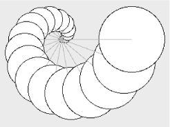
Example 14.2 shows a set of circles whose centers are drawn along an Archimedean spiral (see Figure 14.4). An Archimedean spiral is defined by the equation r = a![[theta]](../chars/theta.gif) , where r, the radius (as depicted by the lines) is proportionally dependent on the angle, . For added visual effect, the sizes of the circles are also made proportional to the angle.
, where r, the radius (as depicted by the lines) is proportionally dependent on the angle, . For added visual effect, the sizes of the circles are also made proportional to the angle.
use Tk;
$top = MainWindow->new();
$canvas = $top->Canvas(width => 300, height => 245)->pack();
# Draw a set of circles along an archimedean spiral
# The centers of these circles move along the spiral
# (radius of spiral = constant * theta)
$origin_x = 110; $origin_y = 70; # origin of the spiral
$PI = 3.1415926535;
$circle_radius = 5; # radius of the first circle
$path_radius = 0;
for ($angle = 0; $angle <= 180;
$path_radius += 7, $circle_radius += 3, $angle += 10)
{
# offset of path coordinates: r.cos() and r.sin()
# sin() and cos() like their angles in radians (degrees*![[pi]](../chars/pi.gif) /90)
$path_x = $origin_x + $path_radius * cos ($angle * $PI / 90);
$path_y = $origin_y - $path_radius * sin ($angle * $PI / 90);
# path_x and path_y are the coordinates of the center of the new
# circle. Canvas::create likes top-left and bottom-right corners
$canvas->create ('oval',
$path_x - $circle_radius,
$path_y - $circle_radius,
$path_x + $circle_radius,
$path_y + $circle_radius,
fill => 'yellow');
$canvas->create ('line',
$origin_x, $origin_y,
$path_x, $path_y,
fill => 'slategray');
}
MainLoop();
/90)
$path_x = $origin_x + $path_radius * cos ($angle * $PI / 90);
$path_y = $origin_y - $path_radius * sin ($angle * $PI / 90);
# path_x and path_y are the coordinates of the center of the new
# circle. Canvas::create likes top-left and bottom-right corners
$canvas->create ('oval',
$path_x - $circle_radius,
$path_y - $circle_radius,
$path_x + $circle_radius,
$path_y + $circle_radius,
fill => 'yellow');
$canvas->create ('line',
$origin_x, $origin_y,
$path_x, $path_y,
fill => 'slategray');
}
MainLoop();The text widget displays one or more lines of text and allows you to edit the text. (Its default key bindings are those of Emacs, so, ahem, those of you still using vi...) The widget is powerful enough to address the presentation needs of a web browser, and several projects have done precisely that. The Perl/Tk distribution comes with an implementation of a web browser called tkweb, and Guido Von Rossum, Python's creator, has used Python and Tk for a web browser called Grail, capable of executing Python applets.
In this section, we will take a brief look at the text widget's capabilities, and in Chapter 16, GUI Example: Man Page Viewer, we will study it in greater depth and build an application based on it.
When you want to programmatically insert a piece of text at some position or select a range, you need to specify one or more indices. An index is a string such as "2.5," which means line 2, column 5 (line numbers start from 1, and columns start from 0). The following code creates a text widget and inserts a string at that position:
$t = $top->Text(width => 80, height => 10)->pack();
$t->insert('Sample', '2.5');The text widget supports the notion of a mark, a user-defined name assigned to a single position within the text widget. This position refers to the gap between two characters, not to a line and column pair. This makes it convenient to insert a character at a mark. A marked position is a logical entity; it does not change with insertion or deletion. The widget supports built-in mark names such as insert (where the insert cursor is), current (the character closest to the mouse pointer), wordend (end of the word on which the insert cursor is placed), end (the end of the insert cursor's line), and so on. These mark names can be used in place of the row and column numbers mentioned earlier:
$t->insert("Sample", "end"); # Insert text at endPlease take a look at the text preceding Table A.6 for details on index specifiers. The example code in the following sections creates a text widget and inserts strings at different locations using different types of indexing identifiers.
Indices can also be relative to a base index. For example:
$t->insert('Sample',
           'insert +5'); # 5 chars after insert cursor's position.
$t->insert('Sample', 'insert linestart'); # go to insert position,
# and then that line's startThe widget supports the concept of tags or tagged styles, which are user-defined strings representing a list of text properties (font, color, stippling style, and so on). Consider
$text->tagConfigure('foo',
                    foreground => 'yellow', background => 'red');
The string "foo" can be applied to one or more contiguous ranges of text within that widget, like this:
$text->tagAdd('foo', '3.5', '3.7');This highlights the stretch of text on line 3, character indices 5 through 7. The indices specifying the range can also be absolute or relative mark positions. For example, the following snippet changes the properties of the line on which the insert cursor is positioned:
$text->tagAdd('foo', 'insert linestart', 'insert lineend');Multiple tags can apply to overlapping ranges of text; conversely, one tag can be applied to many ranges. All text widgets support a special tag called sel that reflects the current range of selected text. You can insert new text and apply a section by supplying the tag name as the third parameter to insert:
$t->insert('Sample', '3.5','foo');The text widget allows you to embed any other widget and treat it as a single character, which means that you can have buttons and listboxes in your text moving around as you insert more text.
For single-line text entries, Perl/Tk provides a widget called Entry, which does not support tags, marks, or embedded windows. It is essentially a lightweight version of the Text widget.
Perl/Tk (not the native Tk) also provides a widget called TextUndo, which is a subclass of the Text widget. It provides an unlimited undo facility (alas, there's no "redo"; you cannot undo an undo!) and has methods to load and save text from and to files. This widget is not part of the original Tcl/Tk distribution.
The text widget supports the TIEHANDLE and print methods, allowing it to be used as a module to simulate filehandles. Here's how you can use this facility to redirect filehandle activity to the text widget:
use Tk;
my $mw = MainWindow->new;            # Create a top-level window
my $t  = $mw->Scrolled('Text');      # Create a scrolled text window
$t->pack(-expand => 1,
         -fill => 'both');           # Configure it
tie (*TEXT, 'Tk::Text',$t);          # tie the filehandle and widget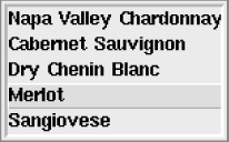
print TEXT "Hi there\n"; # This shows up on the widgetA listbox displays a list of strings, one per line, as shown in Figure 14.5. All strings have the same display characteristics. If you want to mix and match different fonts and colors, you can write a simple wrapper over the text widget and simulate a fancy listbox.
The default bindings of a listbox select and deselect items, but if you want something extra, such as special handling for a mouse double-click, it is your responsibility to bind it to a function of your choice. Selection modes are "single," "browse" (default), "multiple," and "extended." Single or browse mode indicates that only one element can be selected at any time. Browse mode also allows you to drag the selection with button 1. In multiple mode, you can select any number of elements; selecting and deselecting one doesn't affect any other. The extended mode allows you to select multiple elements by clicking and dragging, but a single click deselects the previous selection before selecting the current element.
Like the text widget, the listbox has various ways of identifying list positions in addition to the index; examples include end and active (where the location cursor is poised). Table A.8 describes these indices as well as the listbox's properties and methods. Example 14.3 creates the listbox shown in Figure 14.5.
use Tk;
$top = MainWindow->new();
$wine_list = $top->Listbox("width" => 20, "height" => 5
                          )->pack();
$wine_list->insert('end', # Insert the following list at end
                   "Napa Valley Chardonnay", "Cabernet Sauvignon",
                   "Dry Chenin Blanc", "Merlot", "Sangiovese" );
$wine_list->bind('<Double-1>', \&buy_wine);
sub buy_wine {
    my $wine = $wine_list->get('active');
    return if (!$wine);  # Return if no list item is active
    print "Ah, '$wine'. An excellent choice\n";
    # Remove the wine from the inventory
    $wine_list->delete('active');
}
MainLoop();
The listbox does not provide a property such as command, so we have to use the more general method, bind, to set up a binding between a double mouse-click and a user-defined subroutine. More details on this technique are given in the section Section 14.6, "Event Bindings."
Frame widgets are fairly uninteresting widgets, but come in very handy when you want sophisticated widget layouts or are creating composite widgets.
If you have a complex GUI form, you are better off dividing the screen into major chunks, each with a specific function, and putting each chunk into its own frame. Then at the top level, you can arrange and rearrange these chunks easily. There is more on this in the section "Geometry Management" later in this chapter. Frame widgets, being containers, can be asked to create other "fundamental" widgets such as buttons, text, and scrollbars.
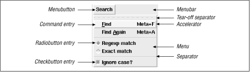
The term "menu" commonly refers to an arrangement whereby a user clicks on a menu button and a collection of label or button widgets pops up. Menus come in one of three configurations: pulldown menu, option menu, or popup menu.
Tk provides a MenuButton widget, which, when clicked, can be made to pop up a Menu widget. The Menu widget is just a container of the menu item widgets; it does not refer to the whole arrangement. We'll use the difference in font styles to distinguish between the concept of menu and the Menu widget. Figure 14.6 shows the components.
To construct a menu, you need to go through the following steps:
Create a menu bar to hold the MenuButton widget. The menu bar is an ordinary Frame widget.
Create one or more MenuButton widgets and pack them into the menu bar.
Ask the MenuButton widgets to create and manage menu entry widgets.
The properties and API of the MenuButton and Menu widgets are listed in Tables Table A.9 and Table A.10, respectively. Example 14.4 shows how the menu in Figure 14.6 is created.
use Tk;
$top = MainWindow->new();
# Use a Frame widget as a container for menubuttons
$menu_bar = $top->Frame()->pack(side => 'top');

#Search menu button
$search_mb = $menu_bar->Menubutton(text         => 'Search',
                                   relief       => 'raised',
                                   borderwidth  => 2,
                                   )->pack(side => 'left',
                                           padx => 2
                                           );
# "Find" menubutton
$search_mb->command(label       => 'Find',
                    accelerator => 'Meta+F',
                    underline   => 0,
                    command     => sub {print "find\n"}
                    );
# "Find Again" menubutton
$search_mb->command(label       => 'Find Again',
                    accelerator => 'Meta+A',
                    underline   => 5,
                    command     => sub {print "find again\n"}
                    );

$search_mb->separator();
$match_type = 'regexp';    # Default search is by regexp.
$case_type = 1;            # Ignore case, by default (enable checkbutton)
# Regexp match
$search_mb->radiobutton(label    => 'Regexp match',
                        value    => 'regexp',
                        variable => \$match_type);
# Exact match
$search_mb->radiobutton(label    => 'Exact match',
                        value    => 'exact',
                        variable => \$match_type);
$search_mb->separator();
# Ignore case
$search_mb->checkbutton(label    => 'Ignore case?',
                        variable => \$case_type);

MainLoop();
This example invokes methods such as command, separator, checkbutton, and cascade on the MenuButton widget ($search_mb). Curiously enough, these methods actually belong to the Menu widget's interface, not the MenuButton's (see Tables Table A.9 and Table A.10). For convenience, Perl/Tk's MenuButton accepts these commands and silently delegates them to its associated Menu widget.
Normally, the menu entries are stacked in the order in which they are created, but you can specify the index position explicitly using the add method. The indexing syntax is similar to that of the listbox and is described in Appendix A. We'll use this method to dynamically create menus in Chapter 16.
Although scrollbars are full-fledged widgets, they are seldom used by themselves; they always control associated widgets. Because of this close association, Perl/Tk provides a convenience function called Scrolled that wraps scrollbars around a widget of your choice without having to explicitly create, size, and pack them. The following example creates a scrolled listbox:
$scrolled_list = $top->Scrolled('Listbox', listbox options,
                                scrollbars => 'se');
Internally, this creates a Frame widget, horizontal and vertical scrollbars (if required), and a listbox; packs all of them together; and returns the reference to the Frame widget (the container). Isn't that nice? In fact, for the most common case of scrolled listboxes and scrolled text boxes, Perl/Tk provides convenient methods called ScrlListBox and ScrlText, respectively, reducing your typing even further:
$scrolled_list = $top->ScrlListBox(listbox options);This is typically all you need to know about scrolling, and you can safely go on to the Section 14.3.10, "Scale" section without loss of continuity.
There are times, though, when you want to handle your own scrolling. For example, suppose you have three listboxes and want to synchronize their scrolling. This means that you need to arrange to have the scrollbar send messages to all three widgets whenever its slider is moved. The subtle issue here is that the inverse also holds true: the widgets also should send messages when they are themselves scrolled by using other means. For example, if you click on one listbox and drag the cursor, the listbox will scroll its own contents. It must then make sure that the scrollbar and the other two listboxes are in sync. In other words, the scrollbar is not always in the driver's seat; it is very much a "I'll scroll you, you scroll me" kind of relationship.
As Table A.11 shows, there is no explicit property tying a scrollbar to a widget, but the scrollbar does have a callback property called command that is notified when the slider is moved. Meanwhile, it so happens that all widgets that are scrollable (listboxes, text widgets, frames, and canvases) support two methods called xview and yview (Table A.12), which tell the scrollable widget what part of its contents to show in its window. Hence, to make a scrollbar send a message to a widget to scroll itself, we configure the scrollbar's command property like this:
$scrollbar->configure (command => [N$widget]);
The scrollbar automatically calls the specified method (xview or yview) on the widget. How does the widget know where to scroll to? Ah, unbeknownst to you, the scrollbar supplies some arguments to the yview invocation, so internally, the message from the scrollbar to the widget might look like this:
$widget->yview('moveto', 30);This tells the widget to align its contents such that the top line or pixel represents the 30% mark.
Now let us look in the other direction, where the widget informs the scrollbar.
All scrollable widgets support two methods called xscrollcommand and yscrollcommand, which should be set up to call the scrollbar's set method as follows:
$listbox->configure ('yscrollcommand', [N$scrollbar]);Figure 14.7 shows this symbiotic relationship. The details of the commands and properties described above are provided in Tables Table A.11 and Table A.12.
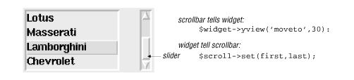
Note that in this example, you don't have to make each listbox drive the other two listboxes. It is enough if each of them drives the scrollbar, because the scrollbar is tied to the other two.
Example 14.5 puts the various configuration commands together for one list.
use Tk;
$top = MainWindow->new();
$car_list = $top->Listbox("width" => 15, "height" => 4,
                          )->pack(side => 'left',
                                  padx => 10);

$car_list->insert('end', # Insert at end, the following list
                  "Acura", "BMW", "Ferrari", "Lotus", "Maserati",
                  "Lamborghini", "Chevrolet"
                 );

# Create scrollbar, and inform it about the listbox
$scroll = $top->Scrollbar(orient  => 'vertical',
                          width   => 10,
                          command => ['yview', $car_list]
                         )->pack(side => 'left',
                                 fill => 'y',
                                 padx => 10);

# Inform listbox about the scrollbar
$car_list->configure(yscrollcommand => ['set', $scroll]);
MainLoop();The Scale widget is like a thermometer. It displays tick marks along a horizontal or vertical "trough" and provides a slider inside the trough that can be moved programmatically or manually (with the mouse or keyboard). Table A.13 shows the scale's properties and methods.
Figure 14.8 shows two scales displaying Celsius and Fahrenheit values (corresponding to 0-100 degrees Celsius). The scales are coordinated so that a movement of one slider causes a corresponding movement in the other.
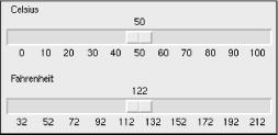
Example 14.6 shows how you might implement it.
use Tk;
# Show Celsius/Fahrenheit equivalence using scales.
$top = MainWindow->new();

$celsius_val = 50;
compute_fahrenheit();
#---------------------- CELSIUS Scale -------------------------------
$top->Scale(orient       => 'horizontal',
            from         => 0,                    # From 0 degrees C
            to           => 100,                  # To 100 degrees C
            tickinterval => 10,
            label        => 'Celsius',
            font         => '-adobe-helvetica-medium-r-normal' .
                              . '--10-100-75-75-p-56-iso8859-1',
            length       => 300,                  # in pixels
            variable     => \$celsius_val,        # global variable
            command      => \&compute_fahrenheit  # Change fahrenheit
            )->pack(side => 'top',
                    fill => 'x');
#---------------------- FAHRENHEIT Scale ----------------------------
$top->Scale(orient       => 'horizontal',
            from         => 32,                   # From 32 degrees F
            to           => 212,                  # To 212  degrees F
            tickinterval => 20,                   # tick every 20 deg.
            label        => 'Fahrenheit',
            font         => '-adobe-helvetica-medium-r-normal'
                              . '--10-100-75-75-p-56-iso8859-1',
            length       => 300,                  # In pixels
            variable     => \$fahrenheit_val,     # global variable
            command      => \&compute_celsius     # Change celsius
            )->pack(side => 'top',
                    fill => 'x',
                    pady => '5');


sub compute_celsius {
    # The Celsius scale's slider automatically moves when this
    # $celsius_val is changed
    $celsius_val = ($fahrenheit_val - 32)*5/9;
}

sub compute_fahrenheit {
    $fahrenheit_val = ($celsius_val * 9 / 5) + 32;
}

MainLoop();
In this example, the Celsius scale calls compute_fahrenheit() when its slider is moved. This procedure changes $fahrenheit_val, which is associated with the Fahrenheit scale. As you can see, using the command and variable properties is typically enough to work with scales. You don't have to invoke the set() method explicitly.
Hierarchical data, like filesystem structures or organization charts, can be represented with the hierarchical list widget, HList. Each entry is indented one level to the right of its parent entry. HList optionally draws branches and can associate icons or other widgets with each entry. An entry is identified not by its index (as the listbox does) but by its "entry path," which is like a file pathname with a separator character of your choice. Table A.14 describes some of the interesting properties and methods of this widget.
Example 14.7 builds a directory browser using HList. Double-clicking on a directory entry expands or collapses the directory and changes the icon correspondingly.
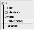
Example 14.7 shows one of way of building the browser in Figure 14.9. Pay particular attention to the code that opens and sets bitmaps and the part that changes the shape of the cursor when it is doing its work.
use Tk;
require Tk::HList;
$top = MainWindow->new();
$hlist = $top->Scrolled('HList',
                        drawbranch     => 1,   # yes, draw branches
                        separator      => '/', # filename separator
                        indent         => 15,  # pixels
                        command        => \&show_or_hide_dir);
$hlist->pack(fill   => 'both',expand => 'y');
# Read bitmap files and create "image" objects.
$open_folder_bitmap   = $top->Bitmap(file => './open_folder.xbm');
$closed_folder_bitmap = $top->Bitmap(file => './folder.xbm');

# Start with the root directory
show_or_hide_dir("/");
MainLoop();

#-----------------------------------------------------------------------
sub show_or_hide_dir {    # Called when an entry is double-clicked
    my $path = $_[0];
    return if (! -d $path);  # Not a directory.
    if ($hlist->info('exists', $path)) {
        # Toggle the directory state.
        # We know that a directory is open if the next entry is a
        # a substring of the current path
        $next_entry = $hlist->info('next', $path);
        if (!$next_entry || (index ($next_entry, "$path/") == -1)) {
            # Nope. open it
            $hlist->entryconfigure($path, image => $open_folder_bitmap);
            add_dir_contents($path);
        } else {
            # Yes. Close it by changing the icon, and deleting its children
            $hlist->entryconfigure($path,
                                    image => $closed_folder_bitmap);
            $hlist->delete('offsprings', $path);
        }
    } else {
        die "'$path' is not a directory\n" if (! -d $path);
        $hlist->add($path, itemtype => 'imagetext',
                           image    => $icons{"open"},
                           text     => $path );
        add_dir_contents($path);
    }
}

sub add_dir_contents {
    my $path = $_[0];
    my $oldcursor = $top->cget('cursor'); # Remember current cursor, and
    $top->configure(cursor => 'watch'); # change cursor to watch
    $top->update();
    my @files = glob "$path/*";
    foreach $file (@files) {
        $file =~ s|//|/|g;
        ($text = $file) =~ s|^.*/||g;
        if (-d $file) {
            $hlist->add($file, itemtype => 'imagetext',
                        image => $icons{"closed"}, text => $text);
        } else {
            $hlist->add($file, itemtype => 'text',
                        text => $text);
        }
    }
    $top->configure(cursor => $oldcursor);
} |  | |
| 14.2 Starting with Perl/Tk |  | 14.4 Geometry Management |

Copyright © 2001 O'Reilly & Associates. All rights reserved.